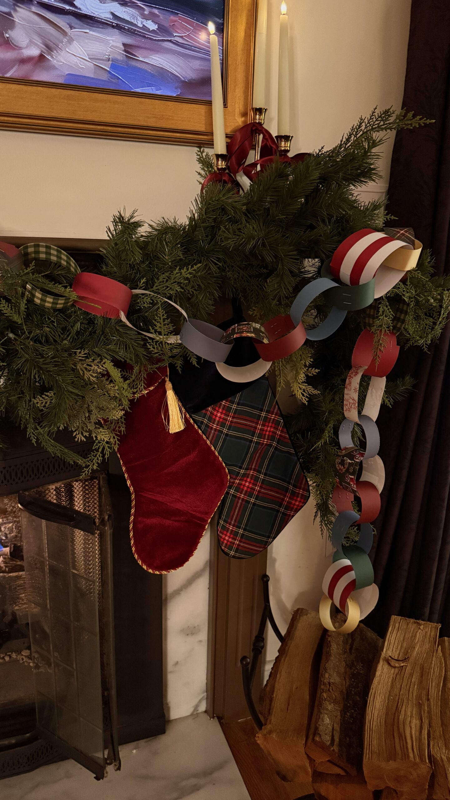
Choosing a Christmas color scheme sounds simple… until you’re standing in front of bins of ornaments wondering why nothing feels right. If you’ve ever felt stuck between wanting something classic, something cozy, and something you, this guide will help you land on a palette that feels effortless, nostalgic, and timeless year after year.
This isn’t about following trends.
It’s about choosing colors that make your home feel warm, welcoming, and true to your personal holiday magic.
Here’s how to do it.
1. Start With the Vibes You Want to Feel
Before you even think about colors, ask yourself:
What do I want my home to feel like?
• nostalgic
• whimsical
• cozy
• traditional
• romantic
• magical
• calming
Your answer will naturally point toward your palette. Want a classic, nostalgic feel? You’ll likely lean red, green, gold. Want romantic warmth? Think burgundy, cream, brass. Want something quiet and snowy? Reach for soft whites, sage, champagne.
The feeling comes first. The colors follow.
2. Build Your Palette Around One Anchor Color
Choose one color you know you love every single year.
This becomes the anchor that grounds everything else.
Your anchor might be:
• deep Christmas red
• forest green
• rich burgundy
• soft gold
• warm brass
• cozy cream
• navy or midnight blue
Once you choose an anchor, it becomes much easier to choose supporting tones.
3. Add 1–2 Supporting Shades
These tones should enhance your anchor color, not compete with it.
Examples:
Anchor: Red
Pairs beautifully with: forest green, brass, cream, cranberry
Anchor: Forest Green
Pairs beautifully with: gold, brown, rust, ivory
Anchor: Burgundy
Pairs beautifully with: champagne, antique gold, evergreen, deep navy
Anchor: Gold
Pairs beautifully with: cream, sage, metallics, natural textures
Keeping your palette small is what makes it feel elevated and cohesive.
4. Mix Textures, Not Just Colors
A timeless holiday look relies on texture just as much as color.
Try layering:
• velvet ribbons
• matte ornaments
• mercury glass
• paper garlands
• wooden beads
• knit stockings
• real greenery
Texture is what makes a simple palette feel full, cozy, and intentionally styled.
5. Use Natural Elements to Ground the Look
Sometimes the secret to a timeless palette is nature itself.
Incorporate:
• cedar or pine garlands
• fresh wreaths
• pinecones
• wooden ornaments
• brass bells
Natural elements soften your look and make your colors feel richer and more connected.
6. Pull From What Felt Magical to You as a Child
This is the piece most people forget — and it’s often the most important.
What Christmas colors made YOU feel something growing up?
• the red of your childhood stockings
• the warm glow of gold lights
• the mix-matched paper garlands you made in school
• the evergreen tree covered in ribbon
Bringing back those childhood memories creates a palette that feels deeply personal — and that is what keeps it timeless.
Your home should feel like you, not like a catalog.
7. Test the Colors Together Before You Commit
Lay everything out on a table or a bed:
• ribbon
• ornaments
• wrapping paper
• greenery
• fabric textures
Seeing them together is the quickest way to know if the palette works. If something feels “off,” remove it. The most timeless color schemes are simple, cohesive, and easy on the eyes.
8. Keep It Consistent Throughout Your Home
Your tree doesn’t have to match every single space, but your palette should flow.
Keep repeating:
• the same metallic (all brass, all gold, etc.)
• the same ribbon color
• the same greenery tone
• pops of your anchor shade throughout
This keeps your house feeling intentional and beautifully pulled together.
9. Let Imperfection Be Part of the Charm
Timeless doesn’t mean perfect.
It means warm, lived-in, layered, and real — the way Christmas should feel.
Lean into mixed textures. Leave room for homemade pieces. Add what sparks joy, even if it doesn’t “match.”
A timeless palette feels collected over years, not curated overnight.
Table of Contents
filed under:
November 21, 2025
How to Choose a Christmas Color Scheme That Feels Timeless
Follow Along
Affiliate Disclosure
Decorating like your grandma had great taste. Rhode Island-based homebody sharing timeless touches, seasonal charm, and a little whimsy along the way.
privacy policy